Francesca Granato
on 10 October 2017
During our user testing sessions on ubuntu.com, we often receive feedback from users about content on the site (“I can’t find this”, “I’d like more of that” or “I want to know this”). Accumulated feedback like this contributed to our decision here on the Web team to find a more standardised way of designing our product landing pages. We have two main motivations for doing this work:
1) To make our users’ lives easier The www.ubuntu.com site has a long legacy of bespoke page design which has resulted in an inconsistent content strategy across some of our pages. In order to evaluate and compare our products effectively, our users need consistent information delivered in a consistent way.
2) To make our lives easier Here at Canonical, we don’t have huge teams to write copy, make videos or create content for our websites. Because of this our product pages need to be quick and easy to design, build and maintain – which they will be if they all follow a standardised set of guidelines.
After a process of auditing the current site content, researching competitors, and refining a few different design routes – we reached a template that we all agreed was better than what we currently had in most cases. Here’s some annotated photos of the process.
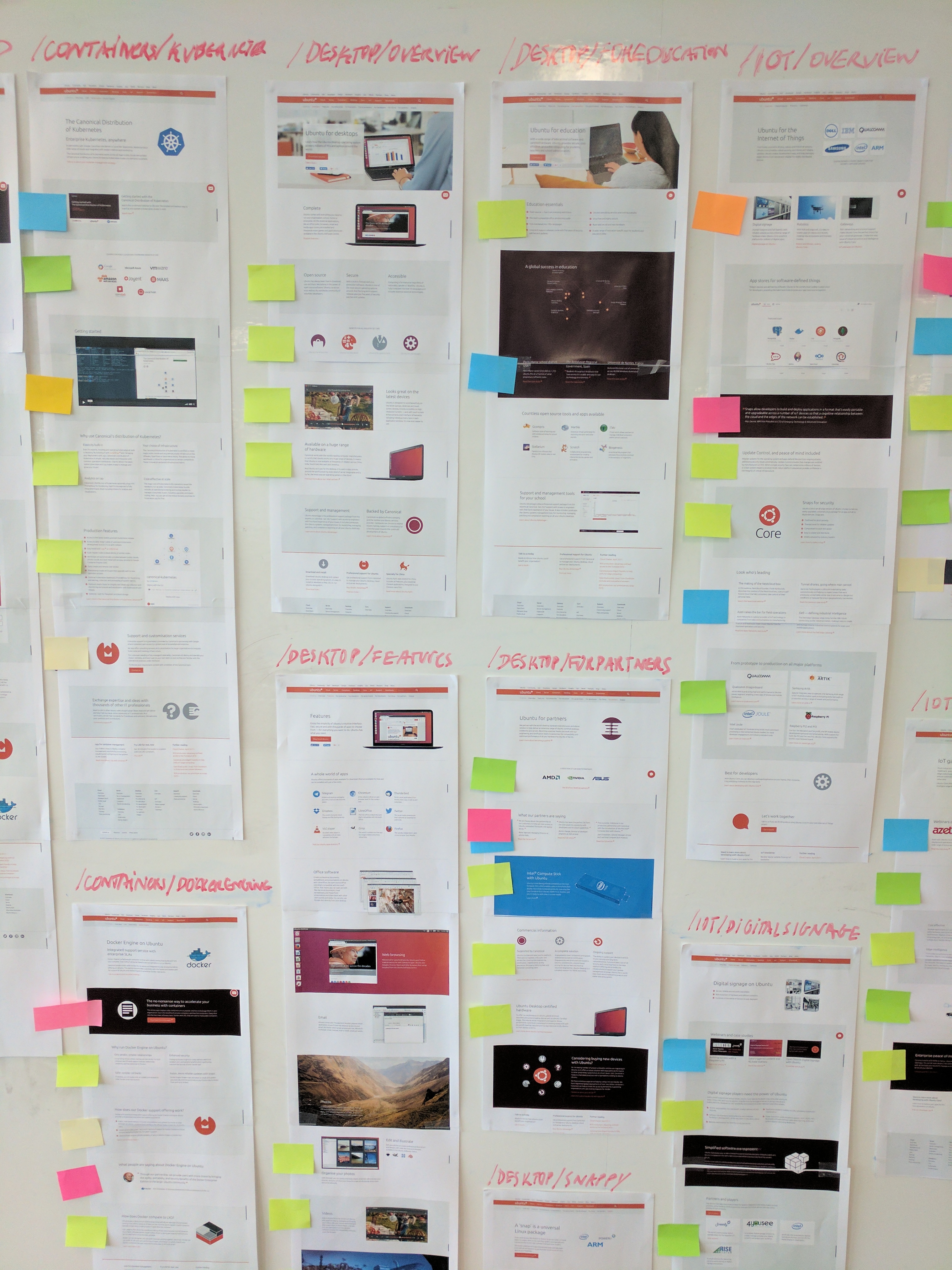
First we completed a thorough content audit of existing ubuntu.com product pages. Here the coloured post-it notes denote different types of content.
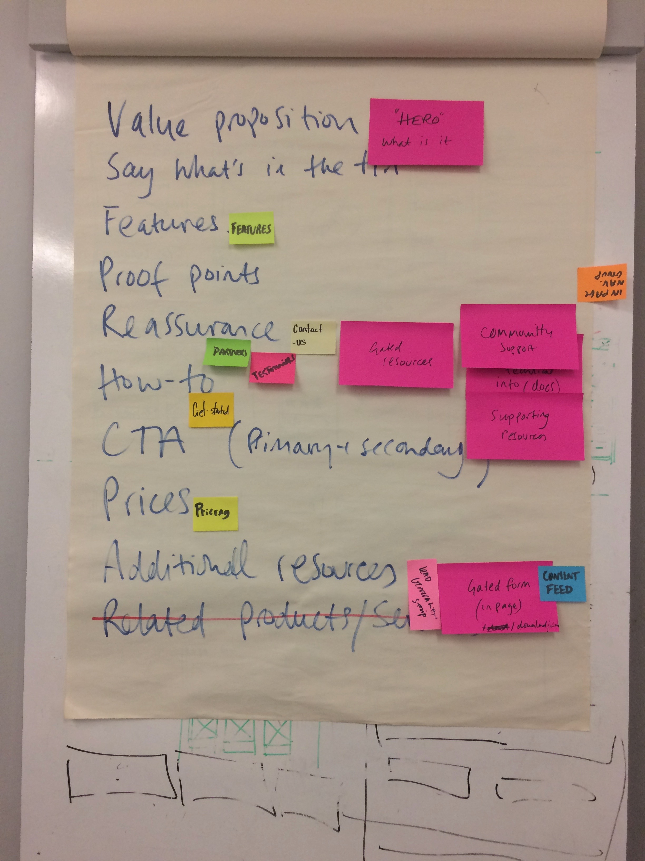
Our audit of the site resulted in this unprioritized ‘short-list’ of possible types of content to be included on a product page.
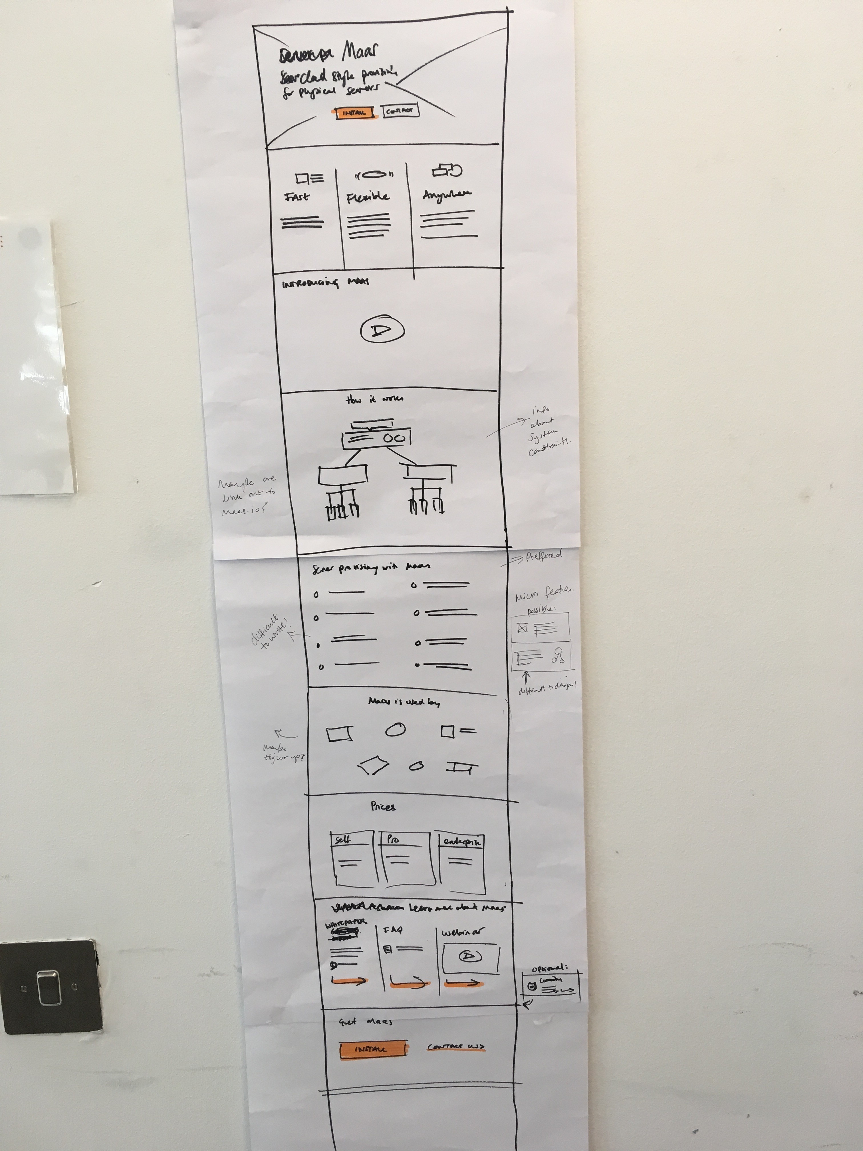
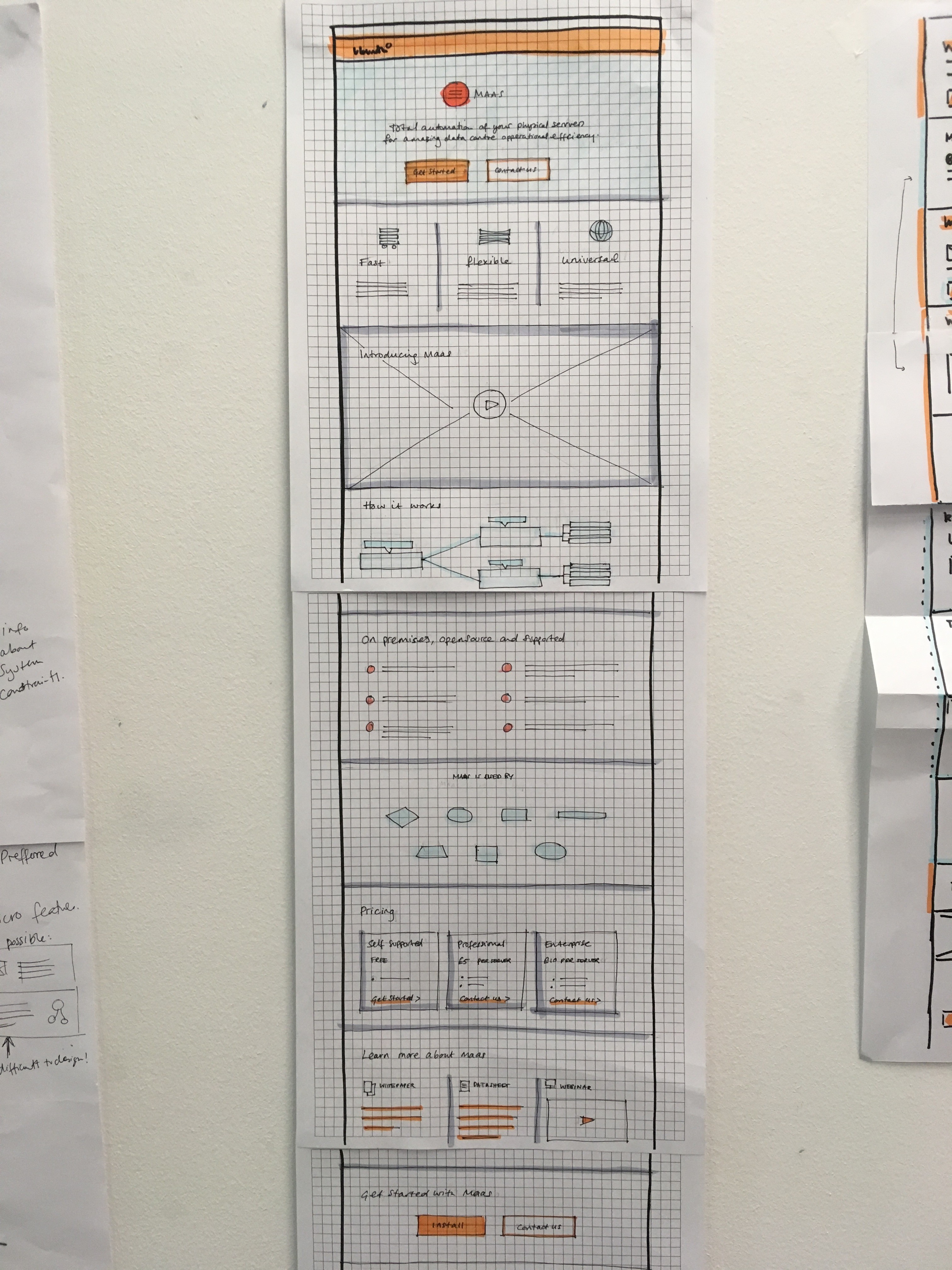
Some examples of early wireframe sketches.
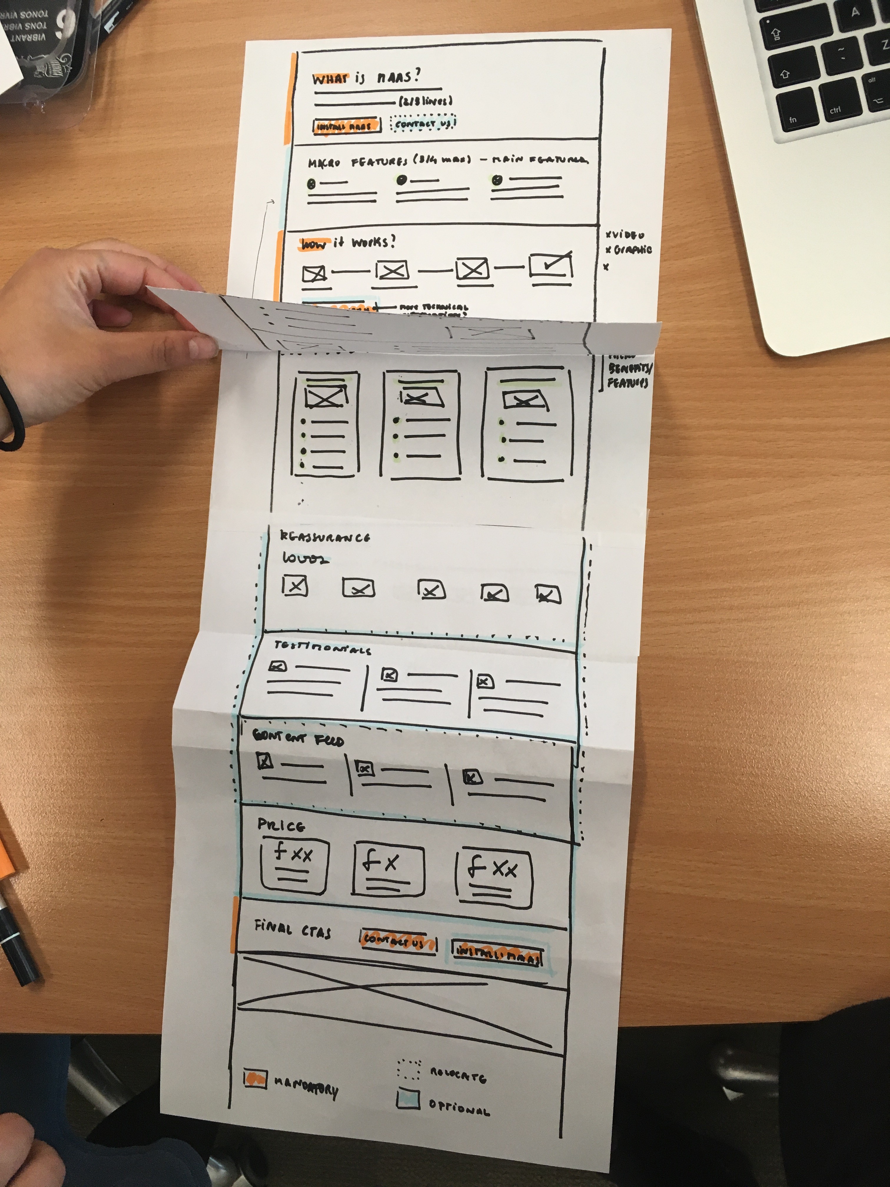
Here is an illustrated wireframe of new template. I use this illustrated wireframe as a guideline for our stakeholders, designers and developers to follow when considering creating new or enhancing existing product pages.

We have begun rolling out this new template across our product pages – e.g. our server-provisioning page. Our plan is to continue to test, watch and measure the pages using this template and then to iterate on the design accordingly. In the meantime, it’s already making our lives here on the Web Team easier!